Recently, a friend commented on how much she loved the alt-text on my images, and I promised I’d do a post talking about how I think about that. I’m aiming this at people talking about things like book covers – whether you’re a reader, a librarian, or an author – though I’ll be linking to some more general resources as well, some of which talk about describing more complex images.
What is alt-text?
Briefly, alt-text is a text description of an online image that is attached to that image. You may have seen the option for it on social media sites or when you’re setting up an image on a blog post. Your goal is to give a description of not only what the image has in it, but why and how it’s relevant to what you’re talking about.
We often talk about alt-text in the context of screen readers, for people who are blind or visually impaired. But alt-text is useful in a lot of other circumstances. Someone who’s avoiding looking at a screen due to a migraine might use a screen reader instead. Some people turn off image loading on sites or in their email to limit tracking images or save data plans or download time.
A well-described image can also offer additional information about the image. The archivists where I work have been improving the descriptions on our photos (for some reasons I’ll talk about later in this post), and better descriptions also give additional search options for your images. That can be very handy sometimes!
A lot of people feel very intimdated by creating alt-text. There are a number of ways to make it easier for yourself, especially if you’re mostly working with the same kind of content (for example, as an author, I have a bunch of book covers).
What’s my background?
In my day job, we care a lot about accessibility. I don’t write a lot of alt-text for work, but I help proofread descriptions for my colleagues in our campus archives regularly. I also check out descriptions they do in our online collections. As an author, I want to make sure my website and social media are accessible to as many people as I can, and creating useful alt-text for images is a big part of that.
What makes alt-text good?
Good alt-text is based on context. You generally want to describe what would matter to someone looking at the image, in the context you’re writing in. An informal chatty blog post is going to want to have different information (and a different style) than a description of a device in a catalogue or a historical image from an archive or museum.
Sometimes you don’t need alt-text: If an image is purely decorative (like a divider between sections of a page), that almost never needs alt-text. If you have a slide deck with a logo repeated on every page, you probably want the alt-text for the logo once or twice (maybe on the first and last slides), but you don’t need to repeat it on every single slide. How you do this depends a bit on your tool.
But if the image is conveying information to people, then you want to include it.
What makes alt-text bad?
Alt-text is bad if it doesn’t exist (on an image that should have it), if it doesn’t convey useful information about the image, or if it’s way too long and detailed for the context of the image and what’s in the image. Here are three basic tips:
- Don’t duplicate information in the text in the alt-text. (I’ll talk about this with screenshots and other images with large amounts of content below.)
- Don’t start “Image of” – the person using the alt-text will already know it’s an image thanks to their software.
- Don’t start with all the details. Start with a basic summary and then get more complicated. That way, if someone doesn’t care about the details, they can skip on to the next part easily.
Some kinds of information may be more or less useful to specific people using your alt-text. Think about how much visual detail matters for the context of the image.
Alt-text for authors
As an author, the images I’m sharing usually have to do with my book covers. Occasionally, they’re character images. Sometimes they have to do with my cat, or something on my various adventures. Most of the time, I’m not describing people (though I’ve got a few guidelines for that below, based on current best practices).
Here’s how I construct alt-text when I’m talking about book covers, whether it’s the cover by itself or in a larger image.
I generally aim for 2-3 sentence for the cover description (because there’s a lot going on on a cover). Ideally, your alt-text would be just a sentence, and you’d have a longer description field with more detail. But in reality, WordPress (and other website tools) and social media don’t make this easy. So I go with something of a manageable length, but more like a paragraph than a phrase.
Pro tip: When I write the blurb and other marketing material for a book, I also write up the alt-text for the cover. That way I can just copy and paste it when I use an image of the cover, and I don’t have to create it new every time.
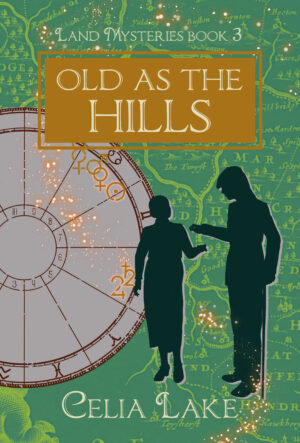
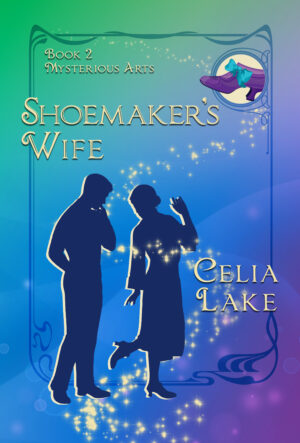
In my examples here, I’m using two books, Old As The Hills and the upcoming Shoemaker’s Wife. If you’re reading this with a screen reader or the alt-text showing, you’ll spot that the alt-text is already on these images: I add it when I upload the file. I also rename the file to something slightly more descriptive rather than a long string of numbers.
1) Start with “Cover of Title of Book”
If someone just wants to know what the image is, this tells them the basic content in one short sentence. If this is the third time I’ve used this cover image in an email, they can just jump to the next text, without hearing the whole description again. If you’re talking about a particular kind of image (photograph, daggeurotype, etching, watercolour, etc.) than including that gives more information about the kind of image.
I don’t bother with my author name. The image is presumably already associated with me in some other way, like being on my website or social media. If I’m writing alt-text that’s going somewhere else, I’ll include “by Celia Lake” after the title. Saying it’s a cover signals the reader to understand the general format we’re talking about and to be aware there’s probably a title coming. (Screen readers might mangle the title, so the additional context cuing can be helpful.)
2) Give a basic description of the image.
This is the first impression, what a sighted viewer looking at the image gets as an initial ‘what’s going on here’.
For example, my base description for Old As The Hills starts: “The cover of Old As The Hills has a man with a cane and a woman silhouetted on a green ground with a map.”
Shoemaker’s Wife starts “The cover of Shoemaker’s Wife has a man and woman in silhouette on a vibrant background of green shading through blue to purple.”
Is this the most exciting prose ever? Nope. But it gets the general sense of the image across.
3) What matters most in this image?
You don’t want the alt-text to go on forever. Next, give the key details. In a romance cover, I probably want to talk about who the people are on the cover and how they are relating to each other.
The next sentence of Old As The Hills says: “She holds out her hand, he is putting something into it, forming a doorway between them.” That’s a detail that a sighted viewer might not consciously pay attention to.
Shoemaker’s Wife continues: “The woman is standing on one foot with one hand in the air, lifting the other and looking over her shoulder at the shoe while the man looks on.” In this case I’m focusing on her position, which is more interesting than his.
I wanted to make sure that Gabe’s cane is mentioned in Old As The Hills, because that’s information a sighted person looking at the image will have about him.
You may want to think about the following kinds of information:
(More about describing people in a minute).
- What objects are in the image? Is a sense of scale or size, placement, or colour relevant?
- What is the environment? Indoors, outdoors, is there visible furniture?
- Are there people? How many, and how are they positioned? What are they wearing or what is their hair like? Does it indicate a particular time period or situation? Think about how to describe gender, ethnicity, skin tone, and disabilities or accessibility tools that are visible.
4) What other details might be relevant?
The background of Old As The Hills is the last part of the description. Here, I say “An astrological chart behind them shows the symbols for Venus, the Sun, Jupiter, and Saturn highlighted behind a splash of glowing stars.”
This gives the reader information about the overall layout (whether or not they know anything about astrology charts). I don’t bother to talk about the details of the map, because while it’s a specific map, the details aren’t very readable to a sighted viewer. (In this case, it’s a map of Kent, in England.) Even if the reader doesn’t know anything about astrology symbols, they might look them up, and I want to give the same basic information in the alt-text.
On the cover of Shoemaker’s Wife, there’s an inset image that is a clue about some of what’s in the book. In this book, that’s not much of a surprise – it’s a 1920s shoe. I say: “A purple 1920s shoe with a big blue ribbon bow is inset in the top right corner.”
You notice I haven’t described the shoe in detail – how high the heel is or any other details. Nor have I described the general proportions or shape of the figures on the cover. I will if there’s something notable about them, but generally I just say “A silhouette of a man and a woman” sometimes with something like “in 1920s formal dress”.
5) Are there other things in the image?
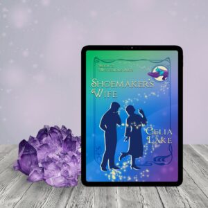
I use a service called BookBrush for my social media and other images beyond the cover, which allows you to insert your cover into all sorts of scenes. When I use one of these, I start the alt-text with “The cover of Book displayed on a tablet, in a [scene].” and then continue on into the description of the cover with “The cover has…” It gives the overall basics of the image without getting too bogged down. I’ve got an example of this in the section below about colour.
Common questions
Should you mention colour?
People wonder if you should talk about colour. I generally do, for several reasons.
First, lots people who rely on alt-text are familiar with colour. Many people who are visually impaired have at least some vision and light perception, and many of those either have some colour perception or have had it at some point in their life. Including the colours if they’re relevant helps give them the same experience as someone looking at the image.
If someone doesn’t have experience with colour, they’ll generally just skim right over that.
Should you get incredibly precise about exactly which shade of blue? No. Not unless you’re talking about images in a work where you’re, say, discussing the different dye shades you can get with natural dyes, or colour matching a bit of pottery with something else.
I also mention colour because that’s a striking feature of my covers, and it’s often a hint to other aspects of the book. The Fossil Door has the burgundy and mustard because of Rathna’s background. The Hare and the Oak has to do with land magic, and so it has the brown and green. Magician’s Hoard has a main character who is of Egyptian background, and he’s got a fondness for turquoise as a colour. I also often pick images for social media and my blog that put the cover in a particular scene or setting, and I tend to pick ones that highlight or resonate with the cover’s colours, so I may mention that.
For example, in this image for Shoemaker’s Wife, I might add a sentence saying “The cover of Shoemaker’s Wife displayed on a tablet, sitting next to a hunk of amethyst that picks up on the purple of the cover.”
What about describing people?
My cover people are always silhouettes, which means I don’t need to describe skin or hair colour, but I do indicate their gender. (I will admit this makes my life easier sometimes.)
The current best practices are to describe someone’s ethnicity and visual characteristics based on what is known about them. Since – as an author – I’m talking about characters whose identity is discussed in the book in question, I’d use the appropriate specifics. I might describe Rathna as a woman of Bengali background with brown skin and dark hair wearing an emerald green 1930s dress, or Gabe as a white man in his early 40s with long dark blond hair and a wooden walking stick, wearing country tweeds.
The Cooper Hewitt guidelines (also linked below) give some great approaches for this, at different levels of relevant nuance, and they give a number of examples. However, their writing is more aimed at museums and curators, so a different context than authors.
What about complicated images
For example, what if you’re including a complicated chart or family tree or screenshot?
In my particular context here – as an author – I generally put something like “Screenshot of Software showing a basic overview. Details described in the surrounding text.” That’s because I’m almost always talking about the details of what’s in the image in the text of the post, and there’s no need to duplicate. It’s fine to just point people back to the text so long as that text actually includes all the relevant details.
The only thing I put in the alt-text are any notes about colour or layout that I’m not talking about in the main text, for example spelling out the layout that I’ve numbered in the image.
Is this always hard?
I’ve found creating alt-text to be like any other skill. The first times were hard (and the first times in a new context are hard), but the more I do it, the easier it gets.
As I do more alt-text writing, I’ve got a lot more comfortable with figuring out what needs to be described and what doesn’t. It takes me a bit longer to write a good alt-text description than a paragraph of that length, but only two or three times longer, not forever. And mostly that’s because I have to stop and make sure I didn’t leave something important out.
Resources
For authors and people with similar creative kinds of content, there’s a great new book out called Essentials of Accessibility by Jeff Adams. An accessibility specialist in his day job, he’s also an author. There’s a great podcast interview with him on Smart Podcast, Trashy Books (which also provides full transcripts for their episodes). His book talks about accessibility for creatives, and he’s got a substantial section on images and alt-text as well as a number of other accessibility tools to consider.
Looking for examples of different alt-text styles? This post from Denise, co-founder of Dreamwidth, is older (from nearly a decade ago), but has a great demonstration of writing alt-text for different contexts with examples using the same images in a different ways.
Cooper Hewitt has a fantastic guide to writing detailed descriptions for art, museums, or historical context. You don’t need to get this complicated, but if you’re trying to describe an image where the details matter, this has a lot of models to help, as well as guidance on best practices for describing people in an image.
Are you describing a complicated diagram? Here’s guidance from the Diagram Center on how to do alt-text for complex images, charts, and so on.